Table Of Contents
- Start With A Clear Purpose
- Define The Intended Reader
- Build A Simple Page Plan
- Write Content That Is Easy To Scan
- Give Every Visual A Job
- Plan For Readability And Accessibility
- Choose A Format That Fits The Use
- Prepare The File For Production
- Review, Test, And Improve The Booklet
- Avoid Common Booklet Planning Mistakes
- Use A Final Booklet Checklist
- Conclusion
A printed booklet can explain, guide, teach, or persuade, but only if readers can quickly understand how its information is organized. Before choosing colors, typefaces, or images, decide what the booklet needs to accomplish and how a reader will use it. That planning step keeps the finished piece focused instead of crowded.
Whether you are preparing an event program, a school handbook, a nonprofit guide, or a short product catalog, the format should support the content. For projects that need a compact, page-turning format, Printivity’s saddle-stitched booklet service is one option to consider after the content, page count, and final file have been planned.
Start With A Clear Purpose
Give the booklet one primary job. It might help guests navigate an event, introduce customers to a service, explain a training process, or provide families with useful school information. Ask one practical question before drafting: “What should the reader know or do after reading?”
A booklet can contain supporting information, but it should not try to solve every communication need at once. When too many goals compete for attention, readers may miss the action, message, or detail that matters most.
Define The Intended Reader
Writing choices should reflect the reader’s age, reading level, prior knowledge, and likely setting. A patient information booklet needs plain explanations and clear next steps. An employee training guide may need procedures, examples, and room for notes. An event guide should help people find answers quickly while standing, walking, or waiting.
Create a short reader profile before writing. Identify what the reader already knows, the problem they need to solve, where they will read the booklet, and whether they will skim it once or return to it later.
Build A Simple Page Plan
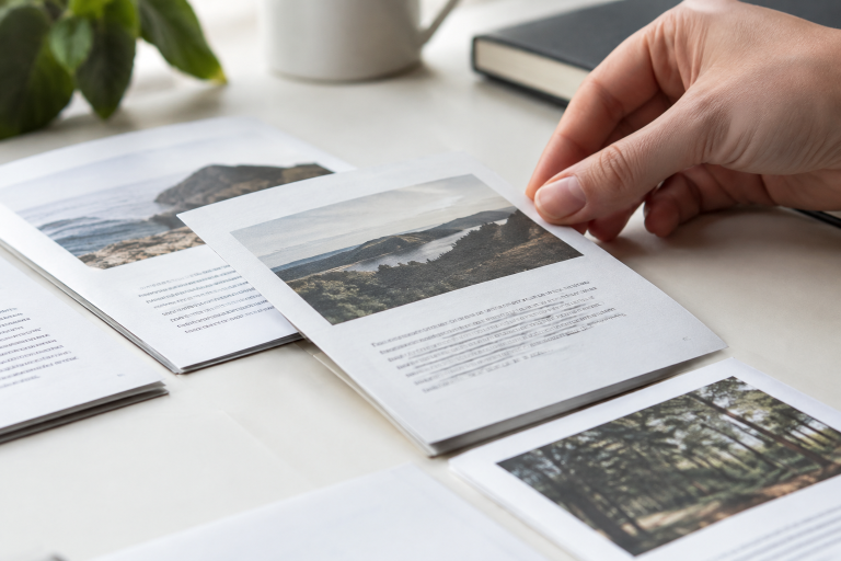
A page plan prevents the design from becoming a collection of disconnected pages. List each section, assign it a purpose, and decide which information deserves the most space. Think about facing pages as pairs, particularly when a photograph, chart, or sequence of steps continues across a spread.
A Practical Page Sequence
- Cover with a clear title and main message.
- Brief overview that explains why the booklet matters.
- Core information is arranged into logical sections.
- Examples, instructions, maps, or supporting details.
- Resources and next actions.
- Contact details or a concise closing page.
Each page should have one clear job. If a page attempts to introduce a topic, explain every exception, present a large image, and ask for action at the same time, simplify it.
Write Content That Is Easy To Scan
Readers often scan before they commit to reading. Help them by using descriptive headings, short paragraphs, bulleted lists, numbered steps, captions, and callout boxes. Put the most important point near the start of each section, then add only the detail needed to support it.
Edit with purpose. Remove repeated ideas, replace complicated words with simpler ones that are more accurate, split dense paragraphs, and read the copy aloud to catch awkward phrasing. Then ask someone unfamiliar with the project to find the key information without guidance. Their experience will reveal whether the structure works.
Give Every Visual A Job
Images, diagrams, icons, and charts should clarify the message, not merely fill space. A visual can show a process, compare choices, explain a difficult concept, or help readers remember an important point. Check image resolution, permissions, captions, and placement before final production.
For example, an event booklet is usually more useful with a simple map, schedule, and short travel notes than with large decorative photos and long blocks of directions. Visuals work best when they reduce effort for the reader.
Plan For Readability And Accessibility
Reader-friendly design accounts for different visual, physical, and cognitive needs. The principles behind accessible publishing reinforce a useful goal for any booklet: make information easier to locate, read, and understand.
Use strong contrast between text and background, readable type sizes, clear heading levels, generous spacing, and uncomplicated tables or forms. Do not rely on color alone to communicate meaning. Captions and labels should make images understandable, and a busy event setting may call for larger text and stronger visual cues than a booklet read at a desk.
Choose A Format That Fits The Use
Size, page count, paper feel, and binding should follow the booklet’s purpose. A compact event program may be easy to carry, while a larger training guide can provide room for diagrams and writing. Consider whether readers need the booklet to lie flat, carry it in a bag, return to particular pages, or view detailed photographs and charts.
Short programs, product guides, school handbooks, nonprofit explainers, and small catalogs all have different demands. Select the format after mapping the content, not before.
Prepare The File For Production
Production details belong in the planning process, not at the final minute. Confirm the finished page size, safe margins, bleed where artwork reaches the edge, high-resolution images, consistent color settings, correct page order, and accurate contact information. Also, check that fonts are embedded or otherwise prepared according to the printer’s file requirements.
When comparing software options, PDF brochure tools can help teams create digital drafts, but the final exported PDF should still be reviewed carefully against the original working file. Page sequences must account for folding and binding, not just how pages look individually on screen.
Review, Test, And Improve The Booklet
A screen review is valuable, but a physical test copy can reveal issues that a monitor hides. Check the cover at normal reading distance, turn every page in sequence, look for text that sits too close to folds or edges, and review colors under ordinary lighting.
Ask a fresh reviewer what they noticed first, where they would look for the main answer, which section felt unclear, and what information seemed absent. Revise based on patterns in their feedback rather than a single preference.
Avoid Common Booklet Planning Mistakes
Common problems include designing before defining the message, using too many fonts, filling open space with weak copy, relying on long paragraphs, placing key details where readers will overlook them, and skipping a physical proof. Other preventable mistakes include unlicensed or low-quality images and leaving file preparation until the deadline.
A simple page plan, restrained visual system, and short review process prevent most of these issues before they become expensive corrections.
Use A Final Booklet Checklist
- The main purpose and intended reader are clear.
- Every page supports the primary goal.
- Headings and page order make information easy to find.
- Images add useful context and are suitable for production.
- Text is readable in the expected environment.
- Important details are not hidden near folds, edges, or busy images.
- Final file settings, spelling, and contact details have been checked.
- A proof has been reviewed by someone else.
Conclusion
A useful booklet begins with planning, not decoration. Define the purpose, understand the reader, map the page flow, write for scanning, and test the finished piece in realistic conditions. When those decisions come first, the booklet is more likely to become a practical reference that readers keep and use.